Why Pixels Isn't So Ideal

I write because it's the most ideal thing for me to do in my own world.
This article has been written for front-end developers who still struggle to understand px, em or rem. I hope at the end of this article, you finally get the hang of it. Cheers! ♥️
Why Pixels Isn't So Ideal
Before I dabble into CSS, I just wanted to let you know that the word Pixel is the contracted form of Pictures + Element. Cool, right? I just wanted to give you that "Do you know…? " kind of fact.
Back to CSS.
Every browser has a default font-size. For some browsers, it's 16px. On others, they either select small, medium or large fonts. It all depends on the browser's choice. I would have told you how to check your default browser font-size, but I can understand that we all use different browsers. So, click on Computer, it will take you to a page that'll help check your default browser font-size.
It's bad practice to use px to measure font-size for text. And this is what I mean: when you set the font-size to a value of 16px or more, it restricts the user's browser from increasing the font size when the website appears on a larger screen.
This brings me to explaining absolute units. From the word absolute, it expresses totality or finality. An example of an absolute unit is Pixels (px). Since px is an absolute unit, it means it has the final say when determining how big or small a text should appear. And it doesn't matter whether a user's browser preference has been set to 40px as their default font-size. As long as you've set the font-size on your code to a value of 32px, 32px will be 32px. Other absolute units are centimeters (cm), millimeters (mm), inches (in), points (pt), and so on.
Deciding what to settle for: em or rem?
Do you want to know what em or rem stands for? I don't know either. You can let me know in the comment section if you do.
Em and Rem are not absolute units like px, but relative units. This means their sizes are relative to something, which is mostly to their parent size. Relative units are best for creating responsive websites, because it's not rigid, but will allow the font-size to adjust accordingly, to different screen sizes.
Em unit
Em is mostly used to size a text. And its size is relative to the font-size of the parent element.
Here is what I mean:
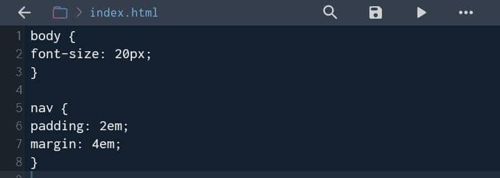
What will happen is, the padding will be 2 × 20px =40px.
And margin will become 4 × 2 × 20px = 160px
1rem = 20px
2rem = 2 × 20px
0.5rem = 0.5 × 20px
What happened here is, the parent element is the body tag with a font-size set to a value of 20px. Every other text sizing that will come after will have a text size that is greater than that of the body tag if it has been set to anything above 1rem. And if there should be another HTML tag under the child of the parent, let's call it the baby, it will take the child font-size, plus the parent font-size, making the font-size of the baby larger than others and too complicated to handle. Which is not worth it.
Body is the parent.
Padding is the child.
Margin is the baby of the child.
Rem unit
The rem unit is relative to the size of the root element, which is the html element.
Here is what I mean:
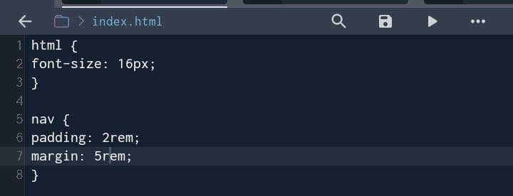
The padding will become 2rem = 2 × 16px
And margin will be 5rem = 5 × 16px
Each element will only be relative to the size of the root element.
If you want to see a live demo of how this unit measurement works, check out this video.
Conclusions
Thank you for reading till the end. If you had a great read, kindly share this article with your code buddy who still uses px for text sizing.


